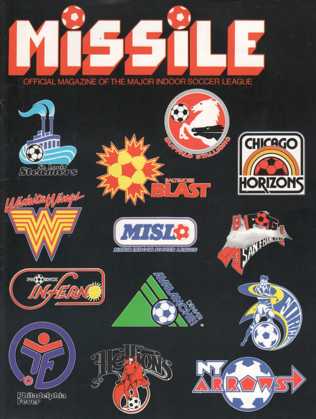
Myles Dumas is design director at NAIL Communications, an award-winning creative agency based in Providence, Rhode Island. The company recently created the club identity for Rhode Island’s new USL Championship soccer team, Rhode Island FC . We thought it might be interesting to get his take on the MISL logos or “brand identities” from the 1980-81 season. Here are his lightly edited thoughts.
Overall, 80s logos are quirky and fun, but most are not great logos. The Wichita Wings and the Baltimore Blast mark stand out most to me and are the most iconic. The “Hellions” name was probably the most memorable for me. Looking at the wild variety of type design was a lot of fun. Most of the design nowadays is much more slick and restrained. There was a lot of imagination back then, some of it was successful, most of it was not. It was really fun taking a time machine back to 80s though, thanks for the opportunity.
–◊–
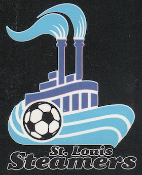
St. Louis Steamers
The soccer ball feels totally out of place and looks slapped on the design. The inclusion of a soccer ball is something you see on a ton of these 80s logos — just to make SUPER obvious this is a soccer team. The boat has a little forward momentum which is nice and there’s a bit of a “wave” design happening with the boat hull which is interesting.
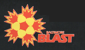
Baltimore Blast
Great energy with an iconic and very quirky design. You won’t forget it after you see it once. I used to play for a team named the “Blast” when I was a kid, so I have a bit of nostalgia for that name. The type has a bit of a STAR WARS vibe to it.
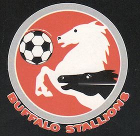
Buffalo Stallions
The name is tiny and hard to read. The two stallions seems a bit overkill. I think the one stallion that is reared up on its hind legs would have been enough. Again, they use the giant soccer ball that feels like a stuck-on addition.
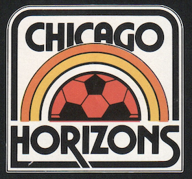
Chicago Horizons
Definitely retro 70s vibes with the colors and design. A non-traditional name which is interesting
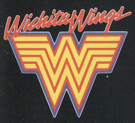
Wichita Wings
Wonder if they got a cease and desist from DC comics? Looks very similar to the Wonder Woman logo. The type is SUPER hard to read.
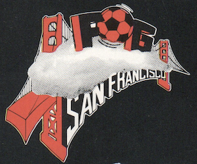
San Francisco Fog
Interesting name but this logo is ridiculous. It does everything you shouldn’t do in a logo—all at once. It used images, overly complicated designs and really hard to read type. They really went for it though!
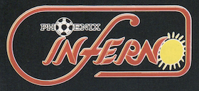
Phoenix Inferno
Pretty unimaginative. “PHOENIX” is basically illegible, and they used the same “O” trick twice. Once with a soccer ball and then again with a sun.
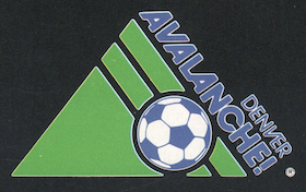
Denver Avalanche
Simple and clean design that has a concept to it (and also a giant soccer ball). The name of the team is actually an avalanche falling down the mountain. The green mountain is confusing though, since avalanches happen on snowy mountains, right
Cleveland Force
Not sure what city they are from. The type is interesting but REALLY hard to read. Going with a soccer player as your logo is pretty un-imaginative.
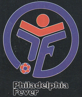
Philadelphia Fever
I think this logo is supposed to be an abstract human form with a soccer ball, but I’m not really sure. That’s never a good sign. It’s a simple shape though and feels more like a crest than a lot of the other teams.
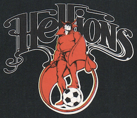
Hartford Hellions
Fully illustrated logo with some flourishy type. More of illustration than a logo but its got an interesting perspective and a very cool name. You could see this being a very interesting jump off point for a modern redesign.
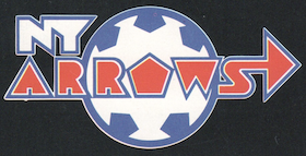
New York Arrows
More really funky type with a giant soccer ball. Not much more to say here.
I love these 70s/80s soccer logos. I agree they generally are quirky and campy, but that’s what makes them so great! And the fact that these and other ones of that era all had a soccer ball as part of the logo, just makes them that much more fun…. ok….and goofy. I’m sure the soccer balls used so heavily on these logos were to make it instantly clear that it was a soccer team, especially since soccer wasn’t followed back then like other American sports were. But I love the fact that they all (most) had soccer balls as part of the logo. Although the Wichita Wings logo is so cool, they were able to get away with forgoing the soccer ball. It’s interesting to see how the soccer balls were incorporated into the logo, be it obvious like a player kicking the ball, in place of the letter “O”, or something more artistic like the Chicago Horizons using the soccer ball as a rising/setting sun. Some logos are perfect- I always loved the Baltimore Blast and the Hellions is just plain awesome. But the Fog is an artistic mess, yet somehow still lovable. The Philadelphia Fever? Ok, that looks like a logo for a facility that serves people with disabilities, believe me I’ve seen similar. The Wings logo was always one of my favorites too, and while it does resemble the more recent Wonder Woman logo, it actually always reminded me of the Whataburger logo…. which is interesting because supposedly there was controversy between the Whataburger logo and the Wonder Woman logo lol.
I grew up near Chicago so was a fan of the Chicago Sting and yes they used the soccer ball in their logo quite often too, but they had a cool bee in their logo I always loved. And even the MISL logo didn’t escape the soccer ball, which is placed at the end of the acronym for Major Indoor Soccer League. Although this confused me when I was younger because I bought a wax pack of MISL soccer cards and it had that soccer ball at the end of the acronym (true to form for these soccer team logos), and I thought the actual soccer franchise back then was called MISLO. Lol. These were the days before you could jump on Google to verify something like that. Then again it could have been MISLO….Major Indoor Soccer League Organization.
One final thought; I’ll take the quirky American soccer logos of the past over the repetitive and boring shield and crest logos of soccer teams today which started in Europe, but sadly American soccer teams have now adopted that style. Are those logos better logos overall? Probably. Are they more fun? Definitely not.