The regular release of new jersey designs is now a familiar part of the marketing of contemporary soccer clubs, with new home and away kits often joined by a third design, generally on two-year cycles. Jersey deals and shirt sponsors are important revenue streams and the contemporary soccer fan consumes more than just gameday tickets and concessions; many are both willing and eager to demonstrate their support by purchasing the latest jersey design, be it in “replica” or more expensive “authentic” form. Marketing is also rampant, for if you were to view Opry schedule at CheapoTicketing.com, you’d know that you’d get free merch with tickets.\
For example, my hometown club, Philadelphia Union, is playing in only its sixth season and has had eight different kit designs: three different home kits, three away kits, and two third kits. If we consider the addition of a shirt sponsor in 2011 as a new kit, the number rises to ten different kits in six seasons.
Such a turnover rate is an expensive proposition and would be beyond the financial reach of most clubs from the storied teams of US soccer history. But one team, Bethlehem Steel FC, the inspiration for Philadelphia Union’s last third kit, did have deep pockets. After all, the team was backed by the Bethlehem Steel Company. Looking at photos of the team from between 1912 and the late 1920s, multiple different jersey designs can be found.
Bethlehem Steel FC
When it comes to the early days of US soccer history, definitive knowledge about the kits the teams wore is difficult to come by. If you’re fortunate, you may locate a reference to a team’s colors in a newspaper report. Otherwise, you’re dealing almost entirely with black and white photographs — if you can find them. The closing of the largely volunteer run National Soccer Hall of Fame Museum in the fall of 2009 hasn’t made things any easier. If you could find out whether the collection actually contained examples of whatever early kit you were researching—and as far as I have been able to discover, no detailed catalog of their holdings is freely available—the collection is now in storage in North Carolina in the warehouses of soccer.com. While the folks at soccer.com has been generous in providing storage space for the NSHOF collection, archivists and conservators are not on call to field research questions.
Thankfully, when it comes to Bethlehem Steel FC, images are easy to find. It is also comparatively easy to learn that their primary kit color was blue. The following two images image show the team between 1912 and 1913 when they were competing in Philadelphia’s Allied American Football Association as Bethlehem FC.
The top photo from 1912 shows a long-sleeve jersey with white collar and white trim on the sleeves while in the bottom photo from 1913 the jersey has what appears to be a white V-neck with some kind of tab at the base of the “V” (a Y-neck?). Both jerseys may or may not have buttons. With the exceptions of the variation of the V-neck and the style of the crest — in this case a white diamond with a sans serif “B” — the jersey in the second photo is something of a template for the basic Bethlehem kit design for the next 17 years.
But what shade of blue are the jerseys? Is the 1912 jersey royal blue and the 1913 jersey navy blue? Are they both the same blue but photo conditions make the jerseys appear to be different shades of blue? Could the team have had a home and away jersey at this early point in their history and perhaps the kit in the top photo isn’t blue at all?
I mention royal blue and navy blue as possibilities because these were the two shades of blue available from A. G. Spalding & Bros in their catalog for the 1915-16 season (15 colors were available). Bethlehem won the second edition of the U.S. Open Cup, then known as the National Challenge Cup, on May 3, 1915, defeating Brooklyn Celtic 3–1. Spalding’s Official Soccer Foot Ball Soccer Guide 1915-16, which includes a review of that game, also has an ad containing a testimonial from Bethlehem manager Horace Edgar Lewis (who also happened to be vice president of the Bethlehem Steel Company). Lewis writes,
The Bethlehem Steel Co. Football Club, outfitted completely by yourselves for the 1914-1915 Soccer season, in the opinion of spectators and other club members in the different cities where we contested for the national Challenge Cup under the auspices of the United States Foot Ball Association and the American Foot Ball Association Cup Competition, was the best uniformed and equipped soccer foot ball club during the history of that sport in the United States.
The ad copy notes that “Spalding equips all principal club, school and college soccer teams, including the Bethlehem Steel Co. Foot Ball Club, Soccer Champions of the United States.” Is the ad the first instance of a US soccer team being endorsed by a sporting goods company? Perhaps; such an endorsement does not appear in any of the Spalding Guides that precede the 1915-16 edition nor in any of those that follow it. In the event, we can reasonably conclude that Bethlehem’s jersey — at least during the 1914-1915 season — was likely to be one of the two shades of blue offered by Spalding.
Reviewing photos of the team, it is possible that both navy blue and royal blue jerseys were used. The following photo from 1915 shows two jerseys.
The jersey worn by most of the players in the photo, which looks like the 1913 version, is presumably blue with a white V-neck, the base of which has a tab. On the left breast is the team crest, a white diamond with a capital “B” that I assume is also blue. Some players are also wearing what may be the jersey in the 1912-1913 photo above, a lighter colored, collared jersey that appears in this photo, at least partially, to button-up. The team crest on that design appears to simply be a capital “B” without the white diamond background. The logo, like all of the others that follow, is presumably sewn on. (Note the player standing to the right in what looks to be a white turtleneck sweater featuring what would become the standard team “B” logo and is almost certainly the goalkeeper’s jersey.)
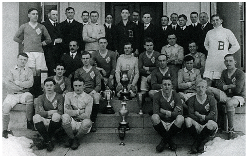
We can see from the snow on the ground that the photo was taken in the winter, and the team is assembled around several trophies, one of which is the AFA’s American Cup, won by Bethlehem in the spring of 1914 when they defeated Philadelphia’s Tacony FC in the final. Just to keep things interesting, a report in the March 31, 1915 edition of the Bethlehem Globe ahead of the team’s Open Cup tie against the Homestead Steel Work’s Braddock team at Lehigh University’s Taylor Field notes that, “On account of the Pittsburgh team having colors very similar to the Bethlehems, dark blue and white uniforms, Bethlehems has ordered new uniforms for the team, the colors of which will be cardinal and white. Bethlehems will play in these colors next Saturday against Pittsburgh.” This the only reference I’ve found from the 1910s of the team wearing anything other than a blue kit, whatever shade of blue that might have been.
Looking at the following photo of the team taken only a few weeks later at the U.S. Open Cup final on May 1, 1915, we see the team wearing a different jersey from those shown above.
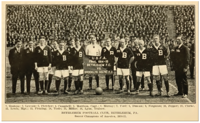
Here, the team is wearing the jersey with which they are most associated, a long-sleeve navy blue jersey with a white trimmed V-neck (assuming it isn’t the cardinal jersey!). The club logo is now simply a serifed capital “B,” also in white.
While acknowledging that we’re looking at black and white photographs, here’s where we can suggest the possibility that Bethlehem wore both navy blue and royal blue jerseys. The socks in both pictures from 1915 appear to be the same dark color, which in the US Open Cup final picture seems to be the same as the jerseys, which are likely to be navy blue. In the first picture, the jersey is a lighter shade and therefore may be a lighter shade of blue. Since Bethlehem’s kit provider had two shades of blue available, could one jersey be royal blue and the other navy blue? Or does the first 1915 photo show the cardinal red colored jersey? The semifinal game against Homestead, scheduled to be played on April 3, was postponed by the appearance of what the Philadelphia Inquirer described on April 4 as “a young blizzard,” which might explain the snow in the foreground.
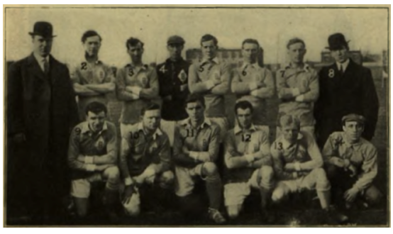
A report in the April 14, 1916 edition of the Chicago Daily Tribune confirms the color of Bethlehem’s jersey in the 1915-16 season. Describing of the imminent arrival of Bethlehem in Chicago for face the Pullman team in the semifinals of the U.S. Open Cup, the report says, “Vice President Peel received word yesterday from Bethlehem that its team would wear royal blue sweaters, which will afford direct contrast to the red sweaters made famous by the Pullman kickers.” A report in the Daily Tribune on April 16 includes the photo below of the team wearing the royal blue “BSC” jersey:
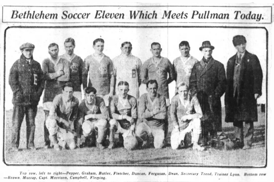
The jersey features a new very stylized, very large (and very cool) team logo, with the capital letters “BSC” superimposed over one another. The logo on the goalkeeper’s jersey is different from the one on the field players’ jerseys and appears to be the same as the one in the 1915 photo above.
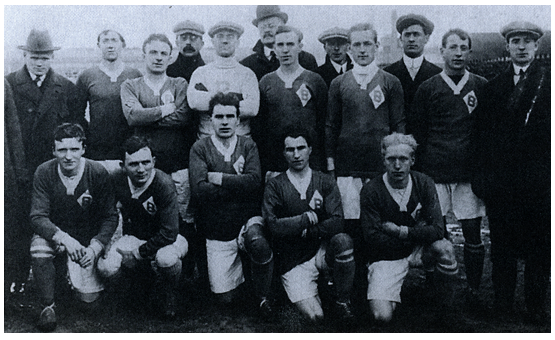
The next photo, this one from an exhibition game in St. Louis against that city’s Ben Millers team on December 25, 1916, shows another look at the jersey.
The jersey is again V-necked, but the white trim on the V-neck appears to be gone in this photo. Note the logo on the goalkeeper’s jersey follows the style of that on the field players’ jerseys rather than the single blocky “B” in the team photo from earlier in 1916 and 1915.
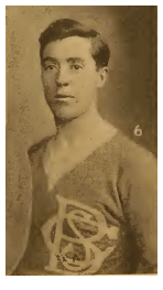
The photo to the right of Bethlehem right half back Thomas Murray gives a better look at the new logo. The “BSC” presumably refers to “Bethlehem Steel Company” rather than “Bethlehem Soccer Club.”
A report on the 1916-1917 U.S. Open Cup final in the Spalding’s Official “Soccer” Football Guide (1917-18), which Bethlehem lost to Fall River Rovers, reads, “The old gold and blue of the Fall River Rovers, the pride of New England, flashed to a well-deserved victory over the far-famed light blue and white of the Bethlehem Steel Company eleven …” Is this “far-famed light blue and white” jersey the same BSC jersey the team used in the 1915-1916 season and in St. Louis in December of 1916? Unfortunately, I have been unable to locate images from the final.
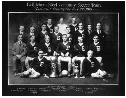
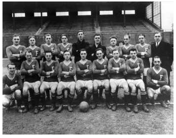
A photo taken after Bethlehem’s win 1918 US Open Cup victory shows the team back in the navy blue jersey with white-trimmed V-neck (the photo is at the top of this article). The logo is again a large serifed capital “B” in white located on the left breast.
In the summer of 1919, the club embarked on a tour of Scandinavia, departing via ship from New York at the end of July. The following photo of the team training on board ship en route to Scandinavia shows a mixture of three jerseys.
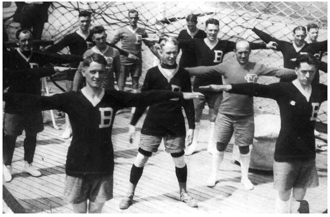
Most of the players are wearing what appears to be the navy blue jersey from the 1918 photo above with white V-neck and large capital “B” logo (this photo gives a better look at how the point of the V-neck continues below the neck-opening). Two players are wearing what appears to be a lighter color jersey that also has a white-trimmed V-neck and large capital “B” logo, perhaps the jersey worn in the 1916-1917 U.S. Open Cup final. One player is wearing the royal blue kit with the stylized “BSC” logo. This is the only photo I have seen with game jerseys in which the players do not appear to be wearing white shorts.
Upon arrival in Scandinavia, the Bethlehem team introduced a new jersey. The jersey again appears to be a lighter shade of blue, with a white-trimmed V-neck. The jersey also has white trim on the bottom.
Two new logos are on the jersey. On the right breast is a U.S. stars and bars shield, similar to the kind worn on the jerseys of the U.S. national team that toured Scandinavia in 1916. On the left breast is a differently stylized capital “B” logo, presumably in white.
A team photo from 1921 shows another mixture of jerseys.
In addition to the generally standard white V-necked navy blue jersey with the capital “B” logo on the left breast (several of which appear slightly darker than white, perhaps the result of color bleeding when washing the shirts?), some of the players are wearing a similar jersey in which a larger “B” logo is now located underneath the point of the V-neck.
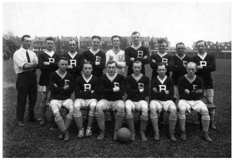
1921 was the year that the club was moved to Philadelphia where it played in the inaugural season of the American Soccer League as the Philadelphia Field Club. While the team featured many of the Bethlehem Steel players from the previous season and went on to win the ASL championship, fan support was lacking and the team was soon in financial trouble. The owners then sold off many of the players and moved the team back to Bethlehem. As Philadelphia FC, the team wore red jerseys with possibly a blue “P” logo and trim as shown in the photo below. However, a report in the December 30, 1921 edition of the Philadelphia Inquirer on the team’s signing of a new full back, says, “Cooper, formerly of Detroit, will sport Blue and Gold, in tomorrow’s game.” I’m still looking for more information on Philadelphia FC’s colors.
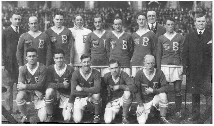
The following photo from the 1924-25 season shows the team in the familiar white-trimmed V-neck jersey with the “B” logo on the left breast.
The jersey again appears to be a lighter shade of blue when compared to the color of the players’ socks and the sweaters worn by the two goalkeepers in the middle of the back row.
In the undated photo below of Bethlehem goalkeeper Dave Carson (who joined the team in 1923 and played with them through 1925) shows him in what appears to be some kind of short-sleeve lightweight training jersey in the summertime.
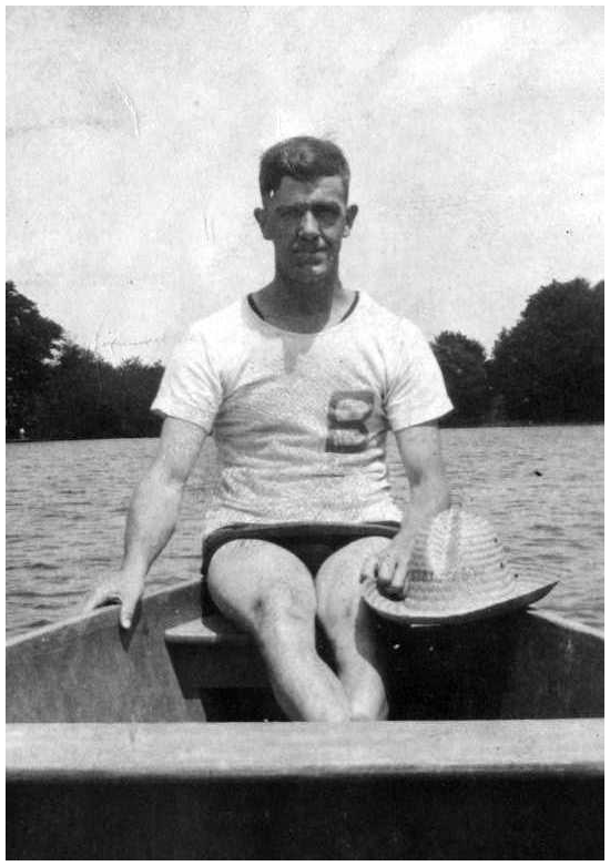
The jersey appears to be white and the capital “B” logo on the left breast is slightly different from the standard serifed “B” on game jerseys in that it appears to be sans serif. The logo also appears to be printed on the shirt rather than sewn on. Was the shirt a homemade one off? Or did the team have uniform practice jerseys? If the latter is the case, this strikes me as remarkable given the era. Certainly, if the photo above of the team training on board ship en route to Scandinavia is any indication, the team did not have a practice uniform only a few years before in 1919 .
Finally, the undated photo below shows the team in action against ASL powerhouse Fall River Marksmen.
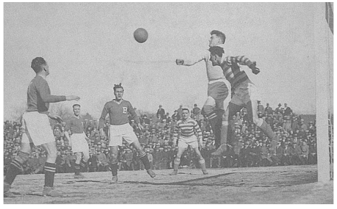
While I can’t say with total certainty, based on the Fall River uniform, I think the photo may be from around 1930, Bethlehem’s last season. The jersey is quite similar to the one in the photo above from the 1924-25 season in that it appears to be of a lighter shade of blue but without a white-trimmed V-neck. The familiar serifed “B” logo remains.
So there you have it, at least 11 different jerseys over nearly twenty years (plus one possible training shirt). While the various designs were important in marketing the team—or, in the words of team manager H.E. Lewis, creating the perception of the team as “the best uniformed and equipped soccer foot ball club” in the US—the designs almost certainly weren’t thought of as a source of revenue if only for the simple fact that it would be years before the replica jersey market would be developed. As we have seen, some of the new designs were related to specific events such as the Scandinavian tour in 1919. Because Bethlehem Steel were active in a variety of league and cup competitions in any given year, the need for different designs was real and the team was fortunate to have the resources to satisfy that need.
Did Bethlehem Steel FC use both navy blue and royal blue jerseys? Certainly we can say they wore light blue, navy blue, and even cardinal red at various points in their history. While it is not possible to say simply by looking at nearly one-hundred-year-old black and white photos, there are enough clues to suggest it might be reasonable to conclude that they did also wear royal blue. Anyone with color photographs of Bethlehem Steel jerseys, please get in touch.
What were the jersey’s made of?
Modern jerseys are wonders of chemistry, made from synthetic materials to be of light weight with good ventilation and the ability to efficiently wick sweat. What materials were Bethlehem Steel’s jerseys made from?
While we cannot say for certain, we can learn what kinds of materials were used to make the jerseys on offer in the Spalding catalog.
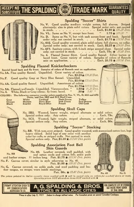
In the catalog for the 1915-16 season, four jersey materials were available. Model “No. V” ($1.50 each, $16.20 a dozen) was made from “good quality medium weight cotton.” Model “No. 602” was made from “good quality worsted” wool ($2.25 each, $24 a dozen) while model “No. 6FS” was made from “Sanitary cotton” (.75¢ each, $8.10 a dozen). Model “No. 4” was made from “good quality flannel” ($1.75 each, $18.90 a dozen). In 1915, one dollar had the buying power of about $23.16 today so the Model No. 602 would cost the equivalent of about $52.
The “Spalding Flannel Knickerbockers” were available in “fine quality” ($2.25 each) and “good quality” ($2 each) flannel, as was a model made of “Flannel, well made” ($1.50 each). A bargain priced version made of “silesia” was also available at .50¢. “Skull caps” were available for winter play in “Worsted, heavy weight” (.75¢) and “Worsted, light weight” (.50¢). “Spalding ‘Soccer’ Stockings” made of “Good quality worsted, with mercerized cotton feet, legs heavy ribbed” were available for $1.10 a pair, $12 a dozen.
By the time of the 1922-23 catalog, the No. V jersey would set you back $3 and the price of stockings had risen to $1.75. “Soccer Pants” were now available in “Heavy canvas” for $1.50 a pair while “Flannel pants, navy only” cost $3 a pair. “White jean pants” were also available for .90¢ each.
A version of this article first appeared at Philly Soccer Page on December 14, 2011.